Hey hey! I have a little taste test for you today! OK, not taste – don’t eat the spray paint. But a comparison of sorts. I told you about the blue desk for my office earlier this week. The one that I didn’t like in it’s blue state, at least in that room. I actually did love it in a more saturated tone than it’s before color – sometimes I find a deeper color shows off the detail better.
One of you commented that the desk, that was supposed to be navy blue, looked more like cobalt blue (a brighter tone). I totally agree – I even noticed it when I was painting but was hoping it would look different out of the bright sunlight.
It didn’t. :) Totally cobalt.
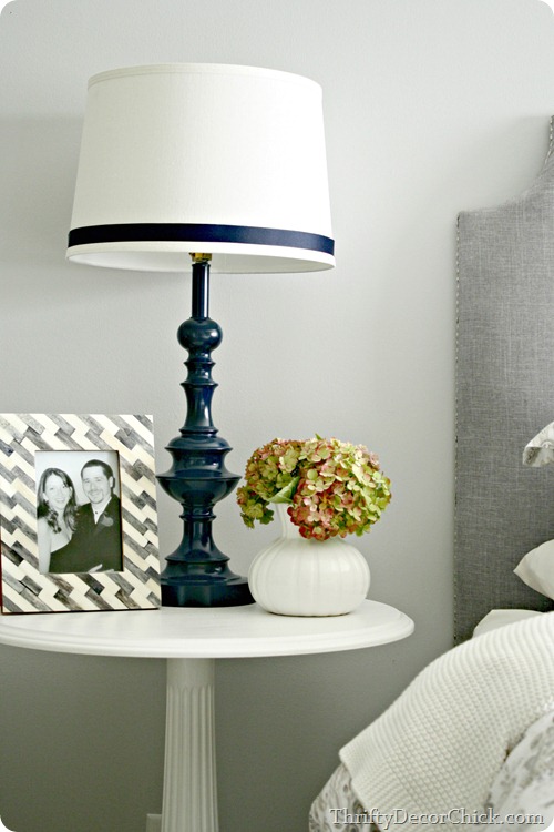
OK, here’s the thing – at first I tried the same navy blue on it that I used on my bedroom lamps:
And it was SO bright. It didn’t look like the same color in the least. I ended up using a different blue that looked a lot more navy, but when I compared the two inside they look like entirely different colors.
So I did a little test – first off, to show that the color on the cap of a spray paint can will sometimes look different than what you get when you spray. Secondly, a color in one spray paint will be different in another. I also noticed a big difference in coverage when I did this as well.
I grabbed five blues out of my stash to do this little test and used some primed scrap wood:
So if you looked at this and looked at my lamps, I’m guessing you’d say the middle one is the paint I used, right?
Even I was surprised. I had to look back at my lamp post to see which one I used, and it was actually the blue second from the right:
Who would’ve thunk it? Here’s the first thing I noticed when I did this -- I love the HUGE selection of colors that Krylon offers but the coverage isn’t great. I never really noticed till I did it right next to others but it sprays very thin and doesn’t cover nearly as well as the others.
I did two coats of each color and the Krylon colors dripped every time:
Due to it spraying so thin I think – it just didn’t cover well, at least compared to some others.
Here’s the other thing – the colors can look much different when you spray. The Stonewash Denim cap on the left has a blue gray tone to it but is straight gray when you spray it. It’s hard to tell in the pics because it actually matches the color of the cap better than some of the others. But I bought this a while back thinking it would have more of a blue tone like the cap and it doesn’t.
The Valspar on the right, called Deep Sea Diving, is another one that is different than the cap. The cap looks like more of a peacock blue color and it sprays a definite cobalt blue.
Here’s the other three close up – note that the one on the left and the one in the middle are both a glossy navy blue:
Can you believe the difference? At the risk of sounding like a Rustoleum commercial, it covered SO much better. (I did two coats of each color.) And to me it looks like a true navy blue, right? The Krylon in the middle is what I used on our lamps and I was actually quite surprised when I looked back and figured that out.
You can see where it dripped a ton too. It would take a good four coats to get good coverage on this white. But as I mentioned, I used it on our lamps and didn’t have any issues. And the navy blue on the lamps is a perfect navy to me, so it will just take more coats to get that true color.
But more coats means using more paint, so that’s something to consider. I used nearly two cans to do the desk and I imagine it would take double that to get good coverage with the Krylon.
The color on the end is one called Mountain View and I’ve used it on a few things over the years. The color on the cap is pretty true to the color. It’s a nice light blue that leans ever-so-slightly gray.
Here’s a close up of the board so you can see the coverage (I shook them all for a few minutes before spraying):
Again, as far as being true to the color on the cap, Rustoleum wins. Coverage-wise, Valspar and Rustoleum did well. But I’ve used the two Krylon colors at the bottom and had no complaints at the time – it was only when I sprayed next to others that I noticed how thin it sprays.
I know it’s impossible to match the color of the paint to the cap exactly, but many of the colors I’ve used are a pretty darn good match. What’s frustrating is if you get it home and spray and it’s not what you thought, you’re stuck with it. You can’t return it after you’ve used it. That’s how you build up a ridiculous spray paint collection. ;)
Do you have a brand of spray paint that you love? A color that is your go-to? Are you still afraid to spray? If so, check out this post for helpful tips!


0 comments:
Post a Comment